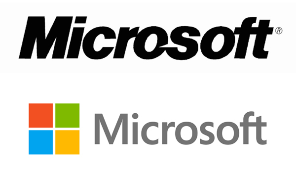
Microsoft gets a new logo

After 25 years
The old one has been around since the days of the Berlin Wall and Matthias Rust, and although we are Cold War buffs it was long overdue for a redesign
The new logo just looks sleeker and it should match the look and feel of new Microsoft operating systems much better. Aside from a new square symbol with no bells and whistles, Microsoft also changed the font and dropped the italic look
The logo does not feature any rounded corners, so Apple could have a harder time filing frivolous lawsuits. As we all know Apple somehow managed to patent a shape invented by butt naked men with chisels in the stone age, whereas Microsoft was apparently more influenced by monkeys breaking bones in front of an Arthur C. Clarke monolith
I had no idea Ballmer starred in 2001. Ed
You can check out Microsoft's official logo video below and find more info here